Neutral Territory

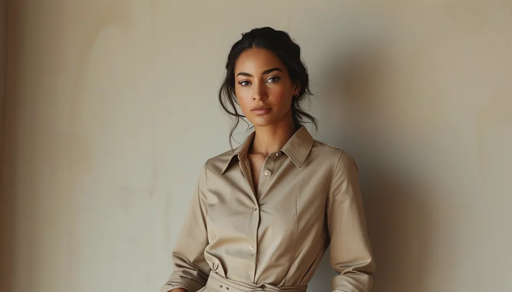
The quiet luxury of a neutral wardrobe

The Neutral Wardrobe: Quiet Luxury Made Easy

2026-07-11

Quick Answer: Neutrals read as expensive because nothing competes for attention — with color removed, your eye goes straight to fabric, fit, and cut. Build a palette wider than beige (cream, camel, taupe, grey, navy, chocolate, off-white), use texture contrast to keep outfits from going flat, and put your budget into fit and fabric rather than variety.

There’s a reason the most effortlessly chic people you know dress mostly in creams, camels, and greys. It isn’t restraint for its own sake.

It’s that a neutral outfit has nowhere to hide — and when everything is well-cut and well-made, that’s exactly the point.

The Neutral Wardrobe: Quiet Luxury Made Easy

Why Do Neutrals Look So Expensive?

Because they remove every distraction except quality.

A bold print or a bright color gives the eye somewhere to land. Take those away and there’s only fabric, fit, and cut left to look at. A tonal neutral outfit therefore looks considered and costly when those three are good — and noticeably cheap when they aren’t. There’s no bright pattern to distract from a poorly hung hem.

There’s a second effect too: neutrals are calm. They don’t demand anything from a room. That quietness is most of what people mean by “quiet luxury” — the outfit isn’t trying to be noticed, which paradoxically makes it more noticeable in a room of louder things.

The practical upside is cohesion. When everything in a wardrobe sits in the same tonal family, essentially every piece works with every other piece. Getting dressed stops being a matching problem.

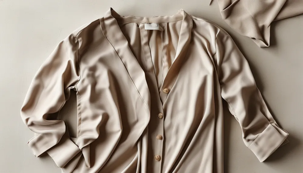
Styling flat lay

What Counts as a Neutral?

Far more than beige — and this is where most neutral wardrobes go wrong before they start.

The working palette:

  • Cream and off-white — the brightening anchors
  • Camel and tan — the warm mid-tones that do the most work
  • Taupe and greige — the bridge between warm and cool
  • Grey, from pale to charcoal — the cool anchor
  • Navy — a neutral that most people file as a color
  • Chocolate and espresso brown — currently the most modern-feeling of the group
  • Black — technically a neutral, but it behaves differently and can flatten a tonal outfit

Building across that whole range gives you endless tonal combinations that always coordinate. Camel over cream. Grey with chocolate. Navy with taupe. None of it requires a decision.

Undertone is the one thing to get right. Warm neutrals (cream, camel, chocolate) and cool neutrals (grey, taupe, navy) can look muddy together if you mix them carelessly. Pick a lane for the outfit and stay in it, or bridge them deliberately with a greige.

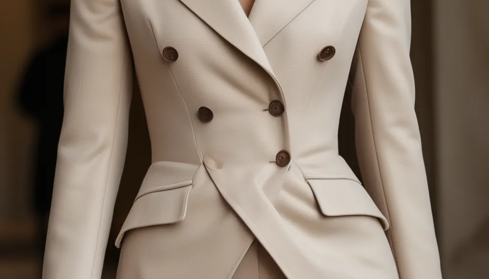
Point detail

5 Mistakes Everyone Makes With Neutral Dressing

  1. Wearing only beige. One tone head to toe with no variation is flat, not chic. You need at least two neutrals in play, ideally three.
  2. Ignoring texture. This is the big one, and it’s covered below — with color removed, texture is the only source of visual interest left.
  3. Buying cheap fabric. Neutrals expose fabric quality more than any other palette. A cheap cream knit looks cheap in a way a cheap printed one doesn’t.
  4. Wearing a neutral that fights your skin tone. Stark white and cool grey can wash out warm complexions; heavy camel can do the same to very cool ones. Hold it near your face before buying — the palette should flatter you, not just each other.
  5. Assuming neutral means shapeless. Quiet color plus a loose silhouette equals invisible. Neutral wardrobes need more attention to cut, not less.

Why Is Texture the Whole Game?

When color is minimal, texture does all the heavy lifting.

An outfit made of three cream pieces in three identical smooth fabrics reads flat. The same three tones in a chunky knit, a smooth leather, and a fluid silk reads rich and deliberate — same palette, completely different result.

Combinations that work:

  • Chunky knit with smooth leather — the reliable one
  • Silky blouse with raw denim — high-low, and it’s why this pairing never dates
  • Wool with cotton poplin — matte against crisp
  • Suede with fine merino — soft against soft, with different surfaces
  • Bouclé with anything smooth — bouclé is doing enough on its own

The rule: two or three textures per outfit, with one dominating. More than that and it stops reading as calm.

Where Should the Money Go?

Fit and fabric, in that order. With no color or print to distract, they’re the entire outfit.

That means a neutral wardrobe is genuinely one of the cheapest to build badly and one of the most demanding to build well. Fewer pieces, better made, tailored where needed. A camel coat that fits properly will outperform four that don’t, and it’s the piece people will remember.

Practical priorities: the coat, the trousers, and one great knit. Those three carry most neutral outfits, and they’re where quality is most visible.

Style guide

FAQ

What colors count as neutrals?

Cream, off-white, beige, camel, tan, taupe, greige, the full grey range, navy, chocolate brown, and black. Navy and brown are the two most people forget, and they’re among the most useful.

How do you keep a neutral outfit from looking boring?

Texture contrast and silhouette. Mix two or three surfaces — knit against leather, silk against denim — and make sure at least one piece has a defined shape. Flat fabric plus loose fit is what produces boring, not the palette.

Do neutrals suit every skin tone?

The category does, but not every shade within it. Warm complexions generally do better in cream, camel, and chocolate; cool complexions in grey, taupe, and navy. Test near your face in natural light rather than assuming beige is beige.

TL;DR

  • Neutrals look expensive because only fabric, fit, and cut are left to look at.
  • Build past beige — cream, camel, taupe, grey, navy, chocolate, off-white.
  • Pick a warm or cool lane per outfit, or bridge with greige.
  • Texture is the whole game. Two or three surfaces, one dominant.
  • Spend on fit and fabric. Coat, trousers, one great knit.
  • Neutral doesn’t mean shapeless — the silhouette has to do more work, not less.

Keep Reading

This article is for general styling and informational purposes only. Trends, sizing, availability and pricing may vary by brand and season.

← All articles