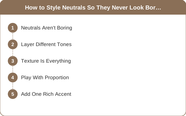
How to Style Neutrals So They Never Look Boring
Quick Answer: Neutrals look boring when everything in the outfit shares the same texture and the same exact shade. Fix it by layering three tones of the same family (cream, camel, chocolate), mixing at least two materials — knit with leather, silk with suede — and adding one rich accent. Texture does the work color normally would.
Neutrals get an unfair reputation. Someone wears beige on beige, it falls flat, and the conclusion is that neutrals are dull.
The outfit wasn’t dull because it was neutral. It was dull because it was flat — one shade, one texture, one plane. Take that same palette, give it three tones and two materials, and it reads as the most expensive thing in the room.
Here’s how to build all-neutral outfits with actual depth, and the specific reason most of them fail.

Why Do Neutral Outfits Look Flat?
Every outfit needs contrast to look intentional. Colorful outfits get contrast for free — red against navy does the job whether you tried or not.
Neutral outfits have to source contrast somewhere else, and there are only three places to get it: tone, texture, and proportion. Use none of them and you get a beige rectangle. Use two of them and the outfit looks styled.
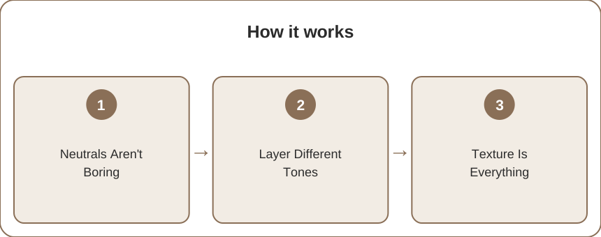
That’s the entire principle. Everything below is just execution.
Layer Different Tones, Not the Same One
This is the core technique, and it’s the one people skip.
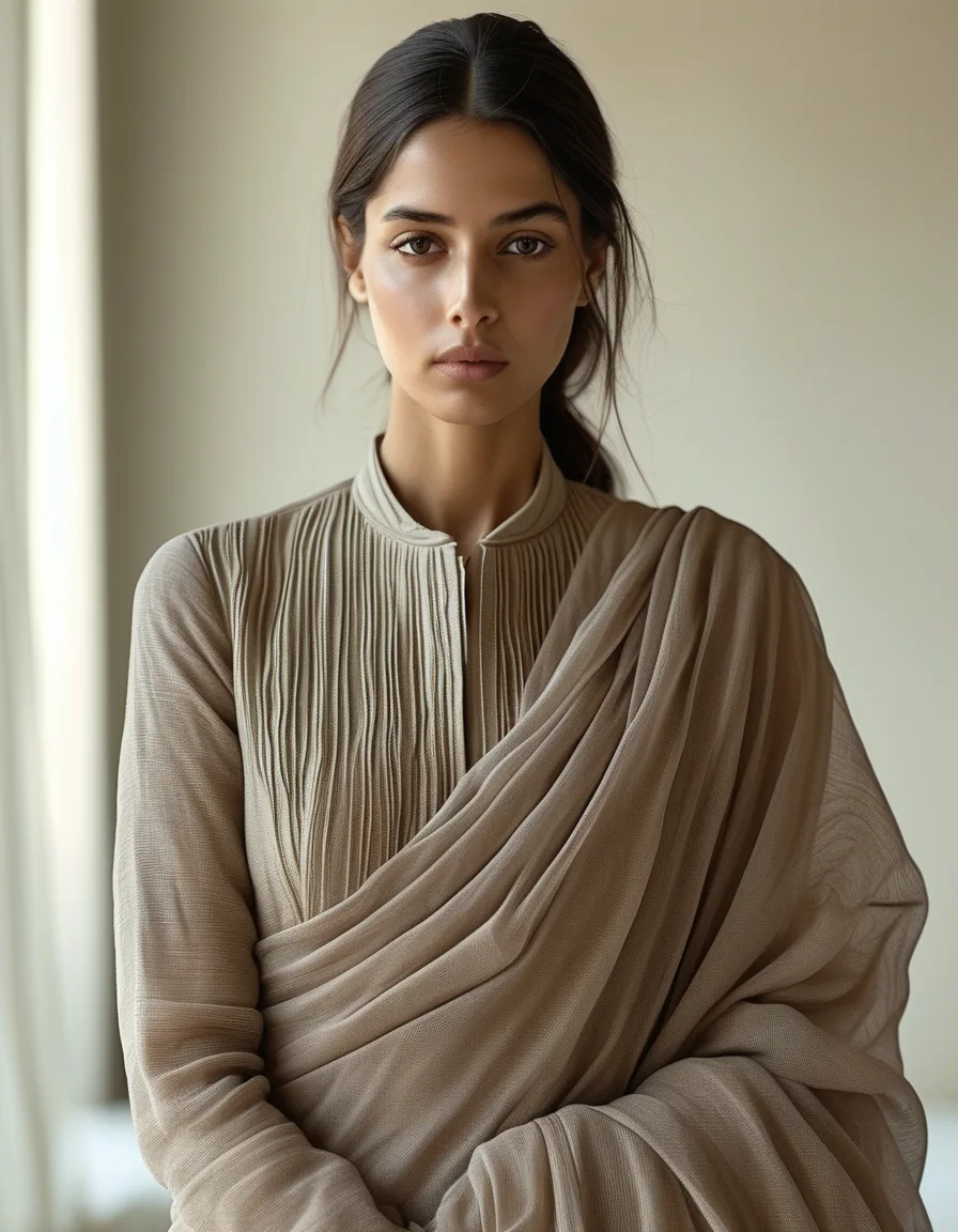
Combining several shades within a neutral family — cream, oatmeal, camel, taupe, chocolate — creates tonal depth that a single shade can’t. The eye reads the gradation as deliberate. A matched set reads as a uniform.
Use three tones, not two. Two tones can look like a near-miss, as if you tried to match and failed. Three reads unmistakably intentional.
Space them out. Cream, camel, chocolate has clear separation. Cream, oatmeal, ivory does not — those three shades sit too close together and the outfit collapses back to flat.
Anchor with the darkest at the bottom or as outerwear. A chocolate coat over cream and camel gives the whole look a frame.
Tonal dressing is what makes the difference between “wearing beige” and “wearing a considered neutral palette.”

Texture Is Doing the Heavy Lifting
When color steps back, material becomes the main event.
Mix at least two of these in any neutral outfit: chunky knit, smooth leather, fluid silk, brushed suede, crisp cotton poplin, ribbed jersey, wool flannel, linen.
The reason this works is light. Each material reflects light differently — matte suede absorbs it, silk throws it back, a cable knit creates its own shadows. Three materials in one color still gives you three distinct visual surfaces.
The easiest high-impact pairing: something soft against something structured. A slouchy oatmeal knit with a stiff camel trouser. A fluid silk slip with a leather jacket.
The one to avoid: every piece in the same weight of cotton or jersey. That’s the flat outfit, and no amount of tonal layering saves it.
Play With Proportion
Interesting silhouettes bring drama to a simple neutral palette when color isn’t available to do it.
Try volume on top with a slim bottom — an oversized cream sweater with straight camel trousers. Or the reverse: a fitted ribbed top with a full, sweeping skirt. Length contrast works too, like a cropped jacket over a long column dress.
Shape becomes the statement. In a colorful outfit, a dramatic silhouette can compete with the color. In a neutral outfit, it’s the only thing asking for attention, so it lands.
Add One Rich Accent
A single accent lifts an all-neutral look from restrained to finished.
Metallic. Gold hardware on a bag, a stack of thin gold bangles, a metallic belt buckle catching light.
A deep tone. Oxblood, forest, or navy in one piece — a shoe, a bag, a belt. Still neutral-adjacent, but it gives the eye somewhere to land.
A striking accessory. Bold eyeglass frames, one architectural earring, a scarf in an unexpected texture.
One focal point is the rule. Two accents starts to compete, and three means you’re no longer wearing a neutral outfit — which is fine, just a different outfit.
Myth vs Fact
Myth: Neutrals are for people who don’t like color. Fact: Neutral dressing takes more styling skill than color dressing, not less, because you have to manufacture the contrast yourself.
Myth: Everything has to match exactly. Fact: Exact matching is the single most common way neutral outfits go flat. Deliberate mismatching across three tones is what makes them look expensive.
Myth: Warm and cool neutrals shouldn’t be mixed. Fact: They can be, carefully. A cool grey with warm camel works when one of them clearly dominates and the other appears once, as an accent. What doesn’t work is a 50/50 split, which just reads as an accident.
Myth: Neutrals are automatically office-appropriate and safe. Fact: A full-volume oatmeal look with dramatic proportions is one of the more fashion-forward things you can wear. Neutral doesn’t mean conservative.
Myth: Black is a neutral like any other. Fact: Black behaves differently — it’s a hard stop that creates strong contrast against every other neutral. It’s useful, but it breaks tonal gradation rather than joining it. Charcoal and chocolate blend far more easily.
Building a Neutral Capsule That Doesn’t Bore You
If you want this to be a default rather than a project, build around five slots.
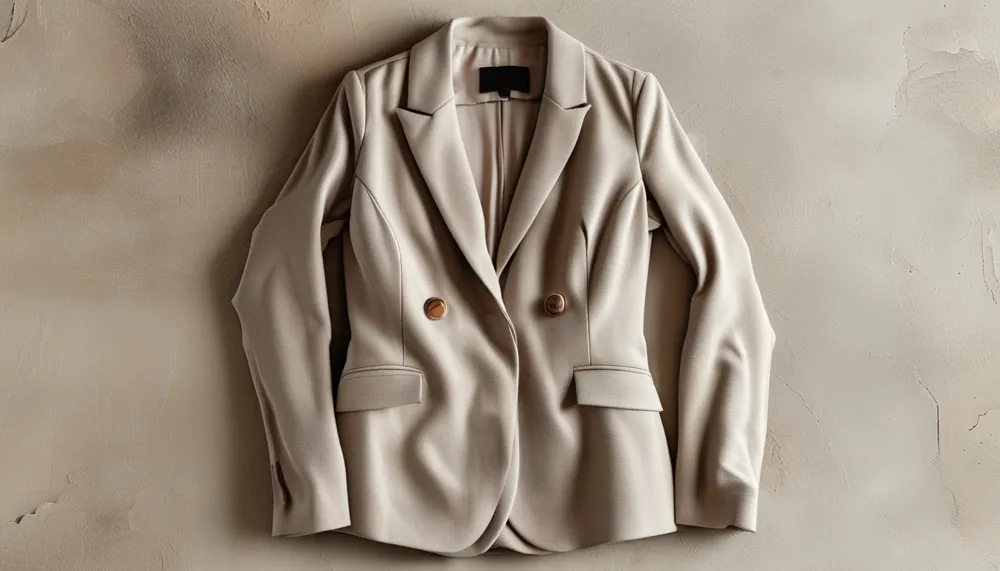
One cream or ivory piece with soft texture — a knit or a silk shirt. One camel or tan piece with structure — a coat or a trouser. One chocolate or charcoal anchor. One leather or suede element, in any of those tones. One metallic accessory.
Those five will combine into more outfits than a closet twice the size, because every piece is doing a different textural job. And if you want the same principle in everyday wear, a set of neutral matching activewear — a taupe or bone high waist legging with a ribbed top in a slightly different shade — is the low-effort version of tonal dressing.
Mini FAQ
What colors count as neutrals?
The core family is white, cream, beige, taupe, camel, brown, grey, charcoal, black, and navy. Olive, oxblood, and rust function as “extended neutrals” — they pair with everything and behave like neutrals in an outfit, even though they’re technically colors.
How do you make a beige outfit look expensive?
Three things: vary the tone across at least three shades, mix at least two textures, and make sure everything fits precisely. Beige is unforgiving about fit because there’s no color distracting from the silhouette.
Can you wear all neutrals to a formal event?
Absolutely, and it often reads more elevated than color does. A cream or champagne gown with gold accessories, or a tonal camel suit with silk, both work at formal levels. Just check the invitation — cream and ivory are off-limits at weddings.
TL;DR:
- Neutrals look flat when tone, texture, and proportion are all uniform.
- Layer three spaced-out tones, not two similar ones.
- Mix at least two materials — soft against structured is the easiest win.
- Add exactly one rich accent: metallic, deep tone, or a striking accessory.
- Fit matters more in neutrals than in color, because nothing distracts from the line.
Neutrals are anything but boring when styled with intention. Layer the tones, mix the textures, play with proportion, and add one considered accent — the result looks quiet, expensive, and completely deliberate.
Keep Reading
This article is for general styling and informational purposes only. Trends, sizing, availability and pricing may vary by brand and season.