Why Mixing Warm and Cool Neutrals Actually Clashes More Than Mixing Bright Colors Does
An all-neutral outfit that somehow still looks slightly wrong is a common, hard-to-diagnose problem, and it’s rarely about needing more color, it’s much more often about mixing warm-undertone neutrals, cream, camel, with cool-undertone neutrals, true white, gray, without realizing the two don’t automatically match.

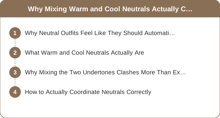
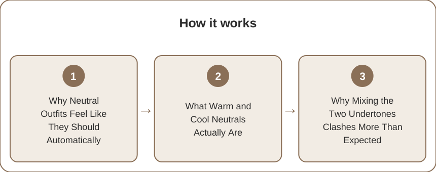
Why Neutral Outfits Feel Like They Should Automatically Match
The assumption: neutral colors being treated as a universally safe, automatically coordinating category, which leads to combining any beige, gray, or white without checking whether their underlying undertones actually align.
What Warm and Cool Neutrals Actually Are
The distinction: neutrals like cream, camel, and taupe carrying a warm, yellow-based undertone, while neutrals like true white, cool gray, and black-based charcoal carry a cool, blue-based undertone, a real difference that’s easy to miss since both categories look colorless at a glance.

Why Mixing the Two Undertones Clashes More Than Expected
The clash: a warm cream piece next to a cool gray piece creating a subtle but noticeable visual tension that’s genuinely harder to place than a clash between two bright colors, since the eye expects neutrals to blend seamlessly and notices the mismatch as something feeling off without an obvious cause.
How to Actually Coordinate Neutrals Correctly
The practical approach: checking whether each neutral piece leans warm or cool by comparing it directly against a true white and a cream side by side, and keeping an outfit within one undertone family rather than assuming all neutrals mix freely, and the frame (neutral colors still carry a warm or cool undertone that has to match for the outfit to look coordinated — checking undertone directly solves the vague off feeling that a supposedly safe neutral outfit can produce.)
An all-neutral outfit that somehow still looks slightly wrong is a common, hard-to-diagnose problem, since neutral colors get treated as a universally safe, automatically coordinating category, leading to combining any beige, gray, or white without checking whether their undertones actually align, when neutrals like cream, camel, and taupe carry a warm, yellow-based undertone while neutrals like true white, cool gray, and black-based charcoal carry a cool, blue-based undertone, a real difference that’s easy to miss since both categories look colorless at a glance. A warm cream piece next to a cool gray piece creates a subtle but noticeable visual tension that’s genuinely harder to place than a clash between two bright colors, since the eye expects neutrals to blend seamlessly, so checking whether each neutral piece leans warm or cool by comparing it directly against a true white and a cream, and keeping an outfit within one undertone family, solves the vague off feeling a supposedly safe neutral outfit can produce.
Keep Reading
This article is for general styling and informational purposes only. Trends, sizing, availability and pricing may vary by brand and season.